Mythologies exhibition graphics by Spin
Posted by Mark Sinclair, 24 April 2009, 15:58 Permalink Comments (6)

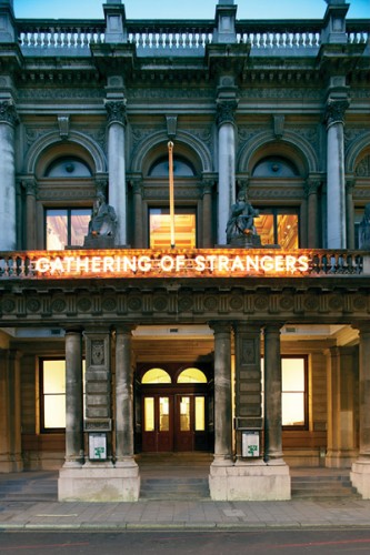
Interior graphics for the exhibition, Mythologies (designed by Spin) at Haunch of Venison's new Burlington Gardens space in London
The Haunch of Venison gallery unveiled its new home last month with a new exhibition,Mythologies, that paid homage to the building's previous incarnation as the Museum of Mankind. The exhibition essentially turned the gallery into a giant cabinet of curiosities and, before it closes this weekend, we wanted to post some images of the graphic design work created for the show by London-based studio, Spin...
The Mythologies exhibition aims to explore the uncanny and the extraordinary as featured in such historic anthropological collections as the Pitt Rivers, the Hunterian and the Sir John Soane's museums. The new show features work by over 40 international artists, including Sophie Calle, Tony Cragg, Bill Viola, Keith Tyson and Damien Hirst.
It's an apt inaugural show for Haunch's new space as between 1970 and 1998, 6 Burlington Gardens housed the British Museum's ethnographic collections, staging exhibitions on subjects ranging from the Mexican Day of the Dead to Japanese Kites.
Spin's Patrick Eley explains the studio's approach to their work for the exhibition:
"Reflecting the ethnographic history of the building, we created a strong totemic typographic identity for the show using Milton Glaser's Baby Teeth – a typeface which contrasts sharply with the grand Victorian gallery space. To create the poster we overlaid this on pages photocopied from Miscellanies – Hans Sloane's mammoth inventory of curious objects he had collected (which became the founding core of the British Museum's collection).
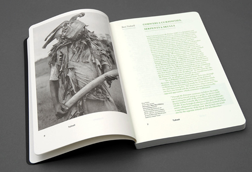
"We wanted to make a catalogue that didn't feel too formal or traditional and so kept it almost pocket-sized. It uses lightweight, warm Munken paper to unify a diverse set of archive and artist imagery, and with soft covers and rounded corners feels very much like a notebook. The title and list of artists are held on a gloss sticker which wraps round the book. The special edition in gold held a limited edition poster by Nathan Coley, while the green version contained a couple of extra sections of installation photography. Unlike most catalogues, there's a huge amount of text - over 50,000 words - so we kept the typography clean and readable - combining Haas Unica and Baskerville Book with green detailing."
"We tried out something new with the VIP invite and laser-etched the identity into heavy 2mm board," explains Eley. "Aside from the funny smell (and the fact we had to wipe the dust off each one by hand), it worked out quite well."
Mythologies closes this weekend. See haunchofvenison.com for more details.


No comments:
Post a Comment