Flow
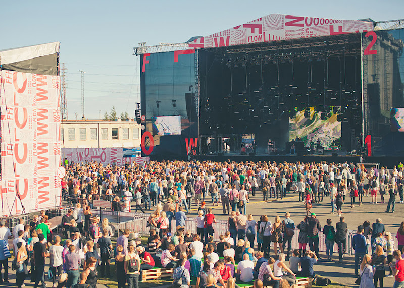
The identity for Flow Festival builds on the idea of the festival crowd as an urban tribe, united by a metaphorical mantra of a visual wordplay set in the bespoke Flow-typeface influenced by contemporary central European trends of postmodern craftsmanship. We see the font as smart, approachable, and humorous. Together with the amulet-like illustrations of Santtu Mustonen, the repetition of letters and images resembles the rhythm of music and creates the core visual language and imagery for the project. This arrangement of elements was used across all media platforms, from web and print to motion graphics, and from venue signage to office stationery.
Illustrator Santtu Mustonen, digital agency Byroo, video production Beige/Harmaa, and musician Matti Pentikäinen worked as Tsto’s key collaborators.
Typeface: Custom


No comments:
Post a Comment